Arjun R.
Interests: Bass Guitar, Music, Science, Composing
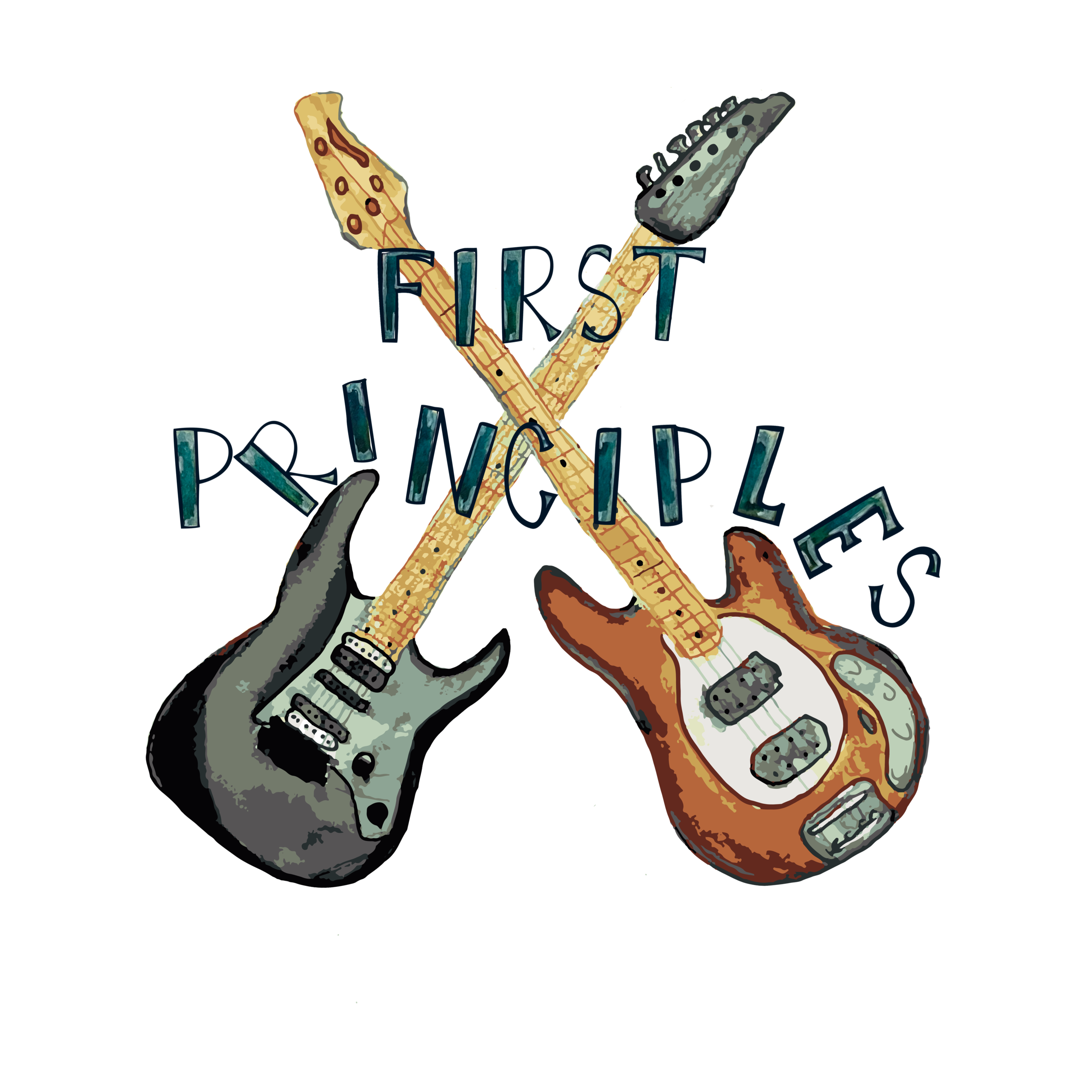
2022-02-14: First Principles Logo
Final Logo
In the beginning, I didn’t have the confidence to make my own logos. I would reach out to other artists to bring my concept designs to life. They were always done beautifully, but I knew there would come a point where I needed to gain this confidence to start doing these designs on my own. This happened when I first created the logo for lil’ kaytro designs and then for
Pathway Immersion. When First Principles asked me to do their logo, I accepted with a deep sense of gratitude knowing how far I’d come.
Arjun first mentioned the concept of both the bass and electric guitar crossing to symbolize a collaboration then somehow incorporating a sense of time passing. These guys had been friends since childhood and were still making music together. I went in this direction using watercolor to paint the guitars and bringing everything into illustrator to make a vector image, but after reviewing with First Principles, we decided to scratch the idea and start new.
First Design - Scrapped
I found a piece of plywood in the garage and started drawing out the letters with a more heavy metal look to them. After playing around and cleaning it up in photoshop, I walked back out to the garage and found another piece of wood that had slashes on it. My dad and I had been working out in the garage the day before and I think this was the remnants of the project he was finishing up. I took a photo and placed it behind the block letters. The day after, my creative juices were flowing and I added color, pastels, and epoxy powder to the mix to see what came out of it. Next thing you know, we had an additional two logos along with the first modified version for First Principles to choose from.
Three different logo designs
In the end, they made a great choice and afterwards told me they were thinking of having t-shirts made. I was super happy about this and will definitely be getting one for myself to represent this great duo.
Interested in a custom design?
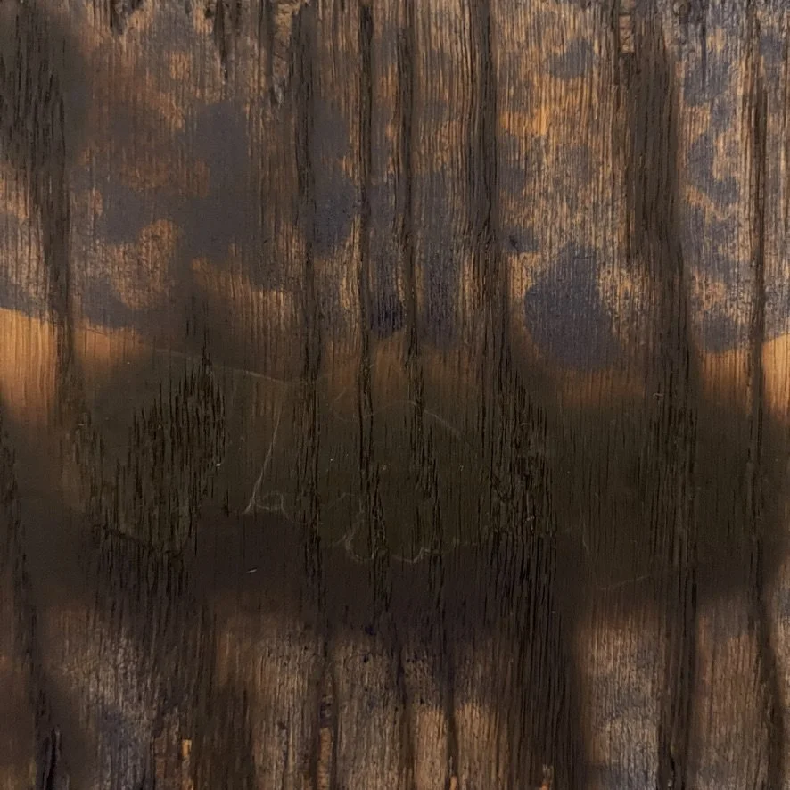
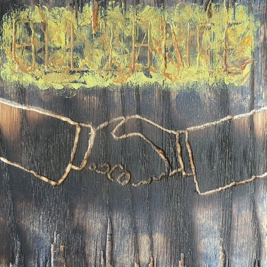
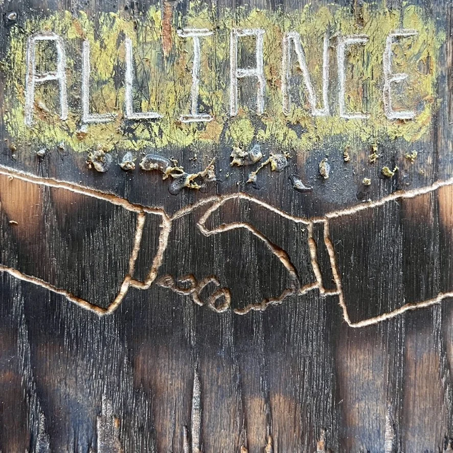
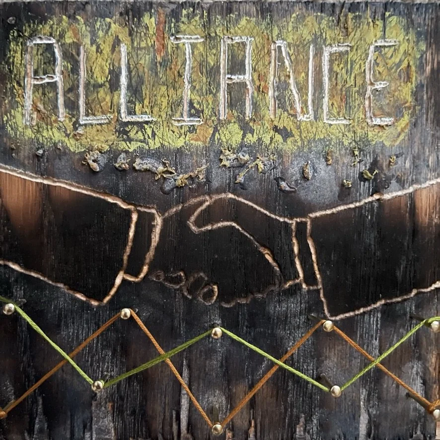
2022-02-03: Alliance Song Cover
Arjun came up with another great concept design that would help the team of scientists he works with to be inspired on their latest project. He had composed this track over the Christmas break and now wanted the visual to help everyone see the possibility of the two molecules they were experimenting with to become allies.
My word for this year is growth so naturally when I went to do
this next song cover Arjun fittingly called “Alliance”, I was eager to expand on my layered technique by incorporating wood and burning techniques. We had a lot of scrap plywood left over from Nate’s van renovation so I began experimenting myself.
I used the torch to burn part of the wood creating a darker area close to the center where I would then take the rotary tool to outline the hands shaking. From there, I added blue stain and took the rotary tool again to indent the letters for “Alliance”. This is when I took out a whole bunch of supplies and began adding layers: green acrylic paint, pastel, rust airbrush paint, white chalkboard marker, superglue (lol), and wood shavings. Then, as usual, I took my knife and peeled back those layers in various areas to give a textured look. The final addition was the nails and two different colored embroidery threads to symbolize further interconnected, joining forces helping one another.
We didn’t have to do to much to this one after I submitted the first copy. It was an instant love from everyone. Hopefully it helps to bring about the positive outcome Arjun and his team are hoping for with their latest, never been done before project.
Progress Photos


2021-11-13: Song Covers Hung Up in Arjun's Office
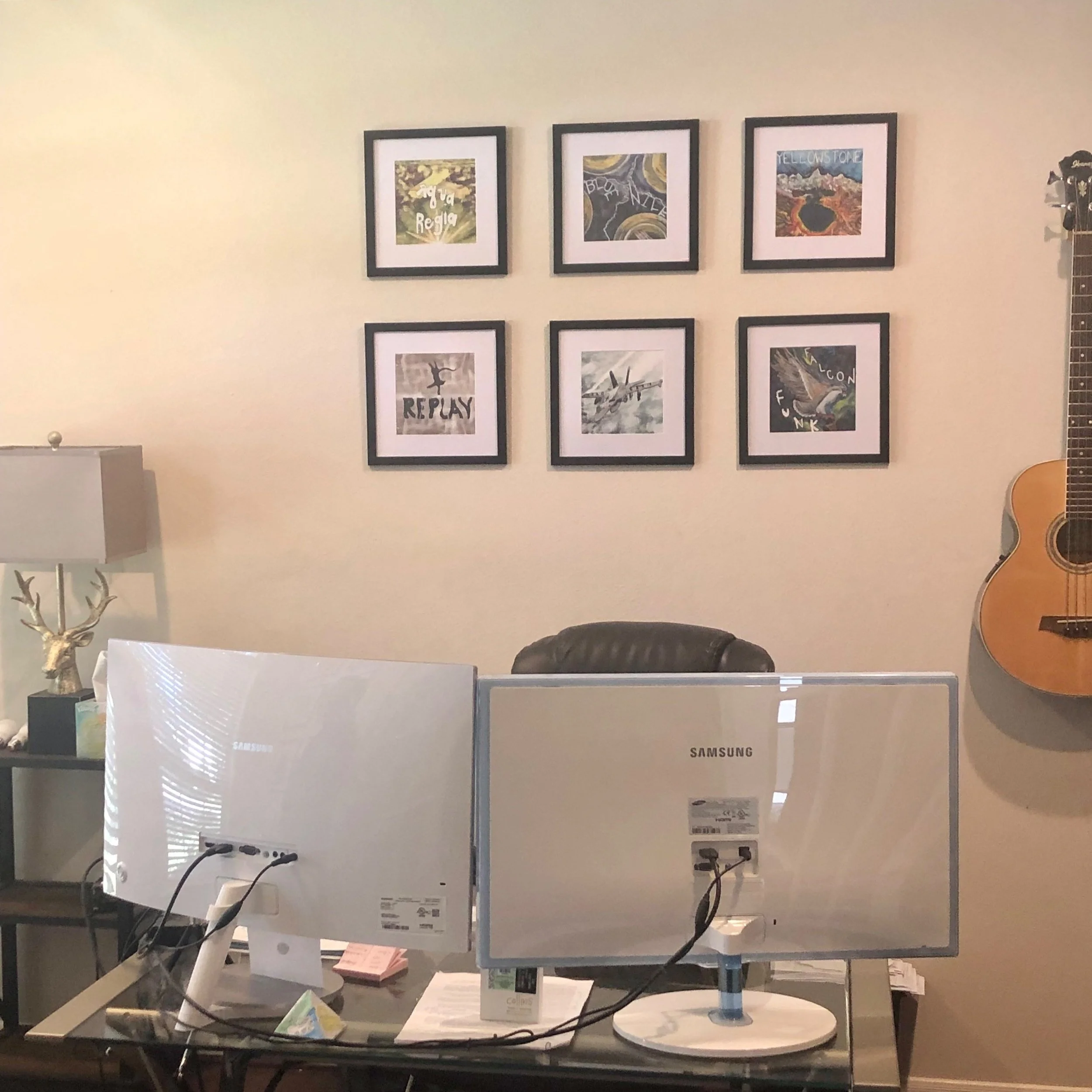
Prior to this, I’d been sending Arjun the originals for all the song covers. Because I work with various layers and then bring everything all together in Photoshop, one song cover could have 2-3 pages of designs. For example, with “Velocity”, the F-18 and words were done on one page then the background was done on a different page. This makes it cleaner
when you go to piece it all together.
Because of this, I decided to start printing them on high-quality paper and sending Arjun those instead. He then completely surprised me when I saw he framed and hung them up on the wall in his office. Don’t they look awesome?
If you read the “Velocity” blog post below, you won’t be surprised to see this song cover was placed front and center. We know who contributed to making that decision (wink wink Muki). I’m sure when Arjun does zoom calls that’s the main cover everyone sees and was placed there intentionally for that reason. I bet it’s started some awesome conversations.
Can’t wait to see how this collection continues to expand in the future.
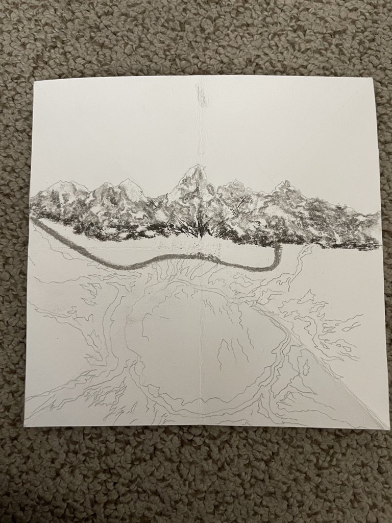
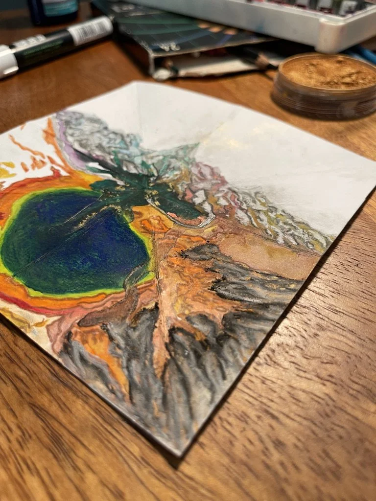
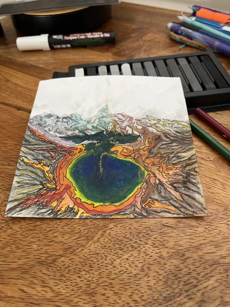
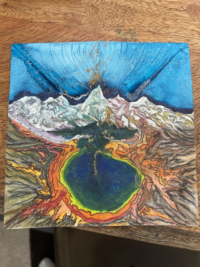
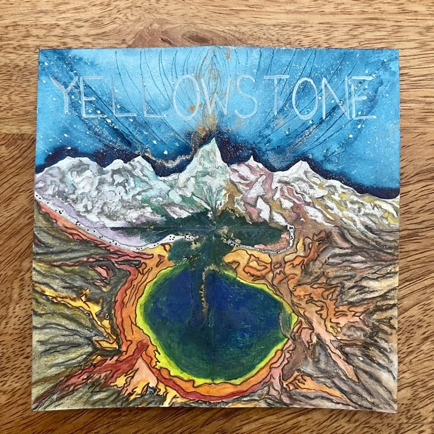
2021-10-03: Yellowstone Song Cover
A friend of mine were up in Pacific Palisades, CA walking around the lake at SRF Lake Shrine and I was telling her how Arjun asked me to create his next song cover called “Yellowstone”. This song cover he wanted to be a pictorial collage, which combined the Grand Teton and a geyser. Arjun had recently visited Yellowstone and was very inspired as many normally are.
As we walked around Lake Shrine and visited their museum, I saw a picture taken from Yellowstone with a car full of people that was stopped on its way
into the park and three baby bears standing on their hind legs balancing up against the car doors. I took a picture and sent to Arjun who messaged back right away and said let’s add the bears into the collage as well.
My friend said to me, “That’s a tall order. Are you going to be able to do that?”
My heart got excited and I thought to myself, “Yes. Yes I am,” as I smiled with a knowingness that this was going to turn out really cool.
I took to drawing the Grand Teton first then I could see how the geyser was going to flow to the south of it. The night sky was going to direct your eye to the top of the highest peak than flow down into the geyser.
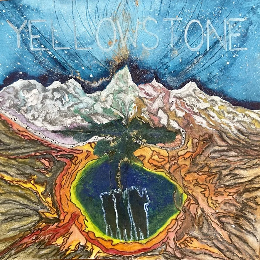
All of this understanding comes through as I keep taking one step further with the design. We tried the bears out in the geyser, but they were a distraction, so we moved them up to the walking path and the “tall order” song cover was complete. We did it!
I saw this magazine cover (pictured right) later on at Sprouts and said to myself, “Hey look! It’s our Yellowstone cover.” 😆
It’s always such a joy to collaborate with others on great ideas like this one. Glad we made it happen.

Progress Photos


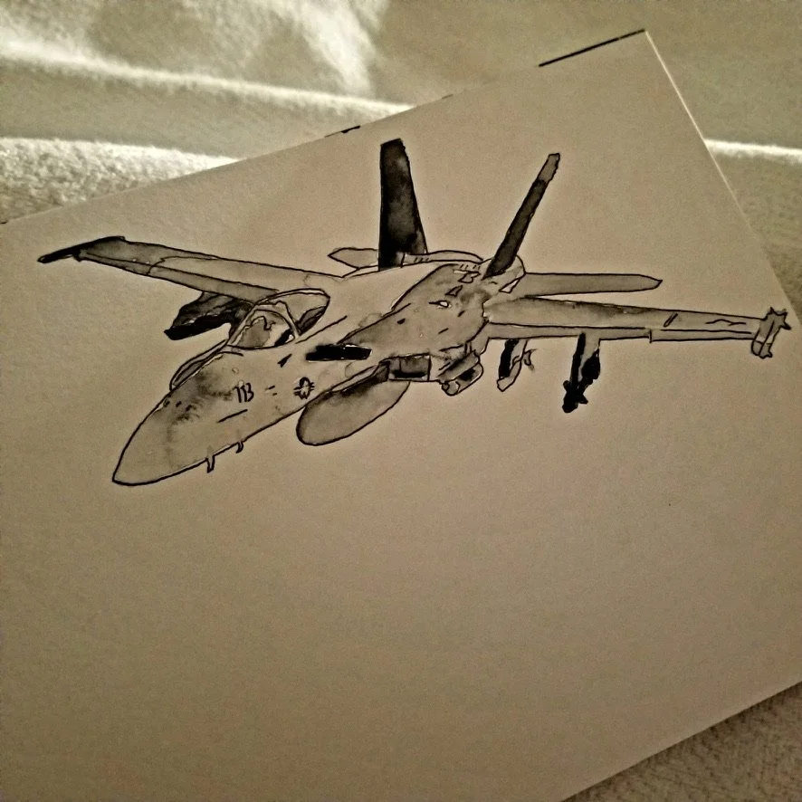
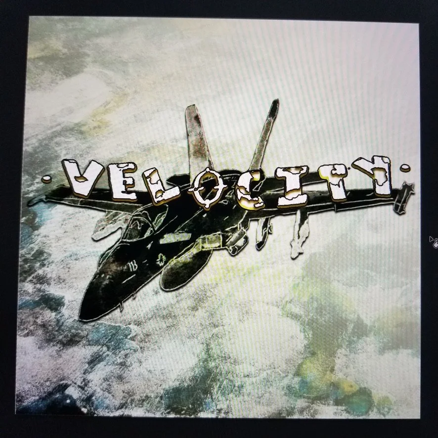
2021-07-20: Velocity Song Cover
A lot of Arjun’s inspiration for the song covers comes from his son, Muki. When I was asked to draw a F-18 supersonic fighter jet for the next song cover, Velocity, I knew this was all him. I had homeschooled Muki for about a year and a half when he was in the first grade and I can’t tell you how many times we were flying around the house with our arms stretched out wide pretending we were jets, airplanes, rockets etc. (Click here to read our fun stories together). We always had a blast. So this one was going to be for him.
After drawing the jet, I used water color to fill it in and give a worn look. The background was a mixture of watercolor, pastels, and charcoal. We played around with the words and color of the plane quite a bit until we landed on making the word “Velocity” go across the wing span. It didn’t stand out as much so the jet could draw your attention instead.
This instrumental track makes you feel like you’re on a mission with this pilot. I should just call him pilot Muk. When you listen to the full track in Spotify, between 03:03-03:10 you’ll hear the sound of the f-18 in the background. It’s such a great addition. I’m sure every time Muki hears it, he is pretending he’s sitting right there in the cock pit, flying at supersonic speed with all his gear on successfully completing his mission.
Progress Photos


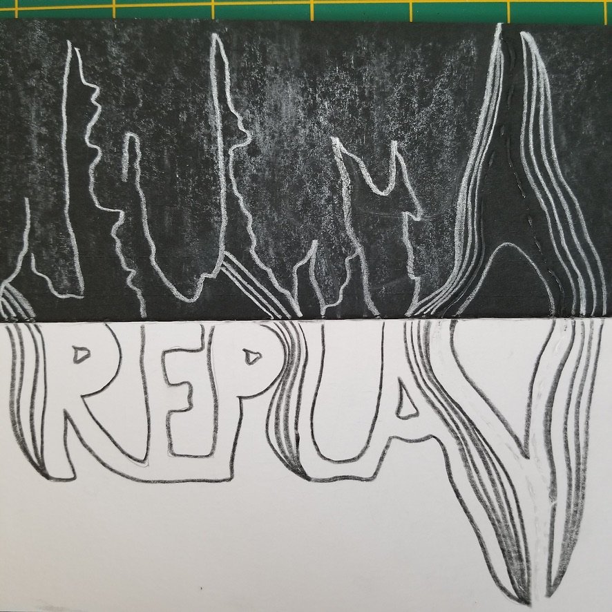
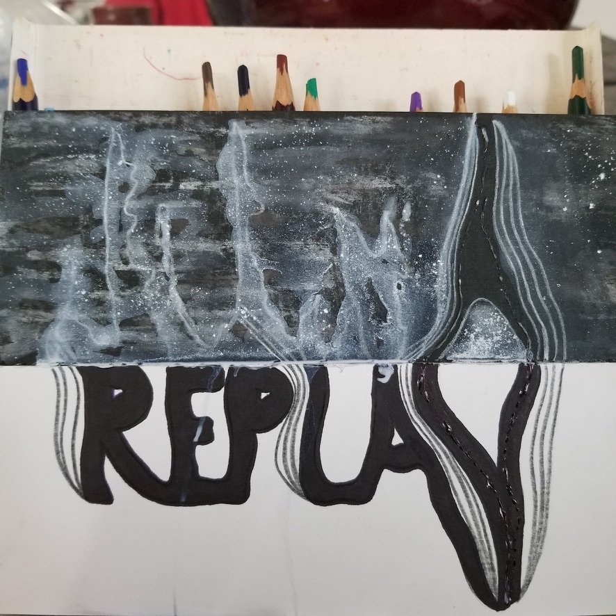
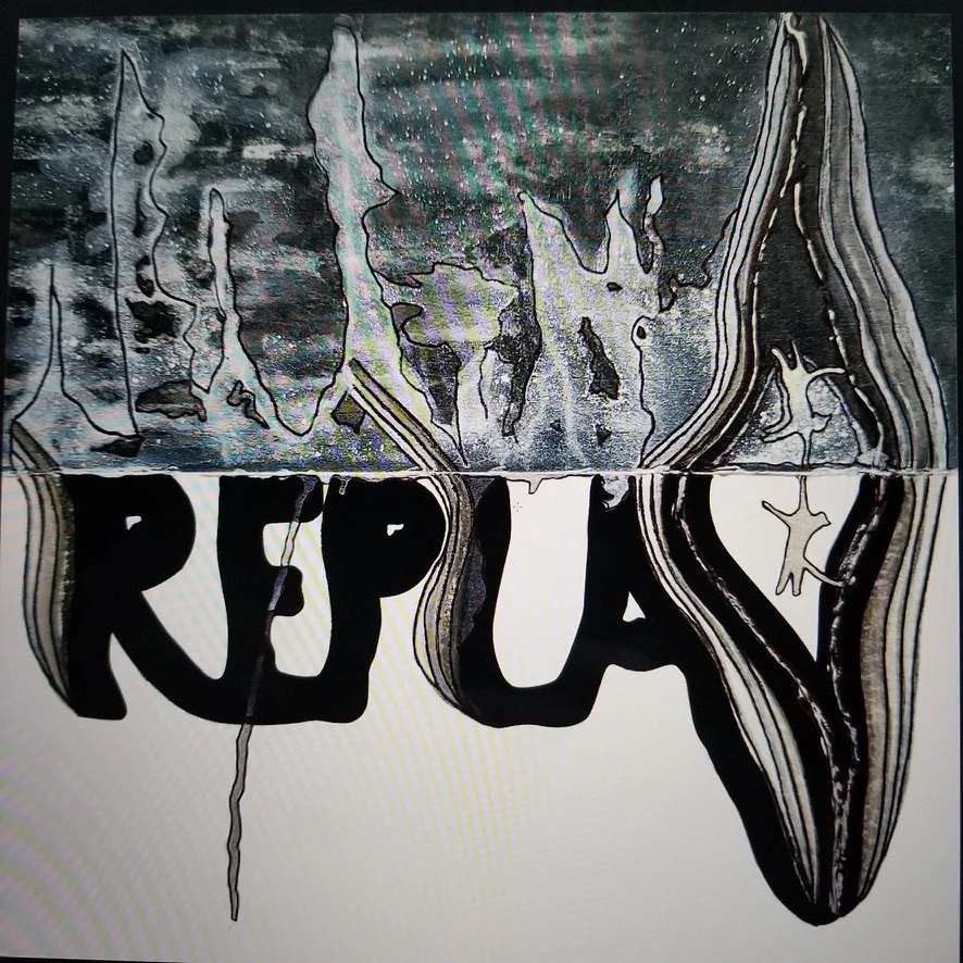
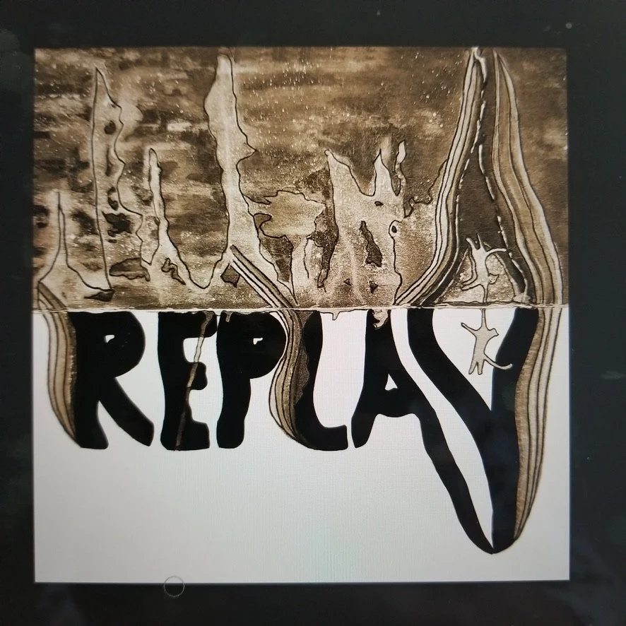
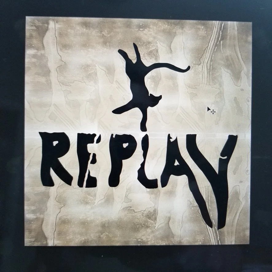
2021-04-25: Replay Song Cover
Arjun started a collaboration with a long-time friend who played the electric guitar. They named their duo, First Principles and their first instrumental track was entitled, “Replay”. The main request for this song cover was to add a playful cat because Arjun’s son loves all types of cats, especially lions, tigers, and cheetahs. The other request was to either do it in black and white or sepia.
As you can tell with everything else I’ve done, I love color, but this
request was a breath of fresh air because I wanted to be taken out of my usual process and see if I could apply my techniques using a different medium like charcoal. I remembered using charcoal a bit when I was in art classes in college and actually found a zip loc bag with some of those old supplies.
I visualized a progress bar spanning across the middle with the sound waves coming off of it in both directions and a cat playing somehow on the bar. Adding together a piece of black and white mixed media paper, I started with white charcoal to draw the sound waves then black charcoal to draw replay.
The first draft was done in black and white, which First Principles decided needed to be changed to Sepia. The cat was hidden in the corner so I pulled him out and made him front and center. Then after a little trial and error in photoshop, I did a mirror effect with the sound waves, simplified it tremendously and made “Replay” super bold.
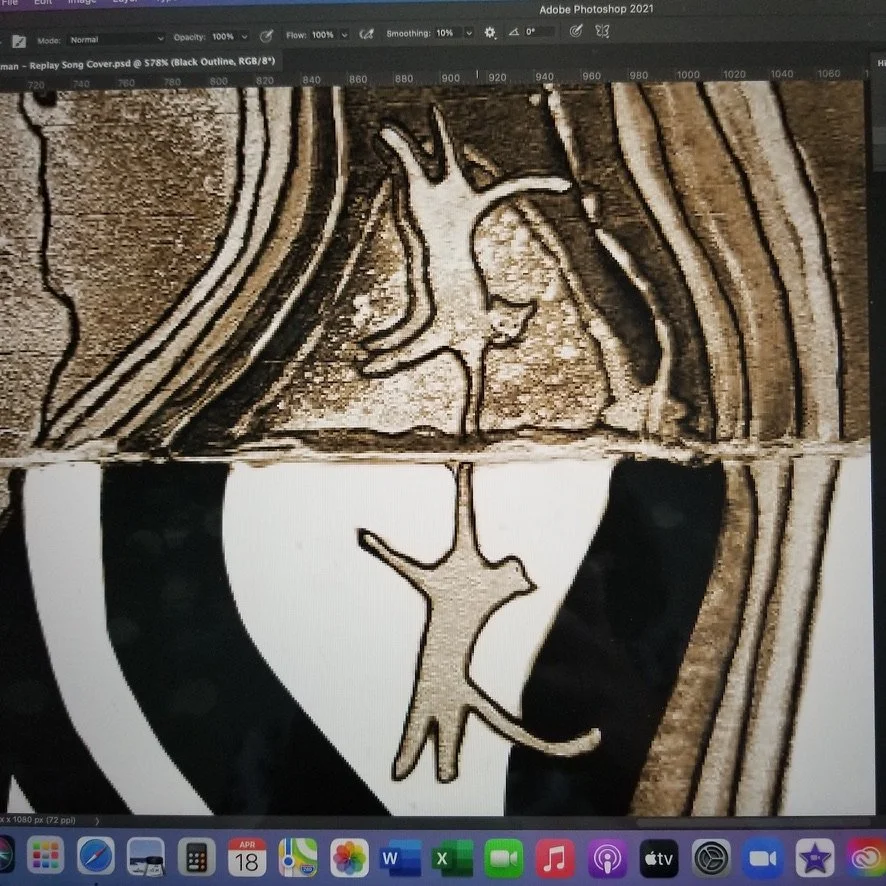
Progress Photos

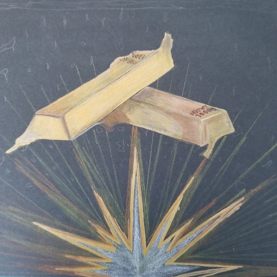
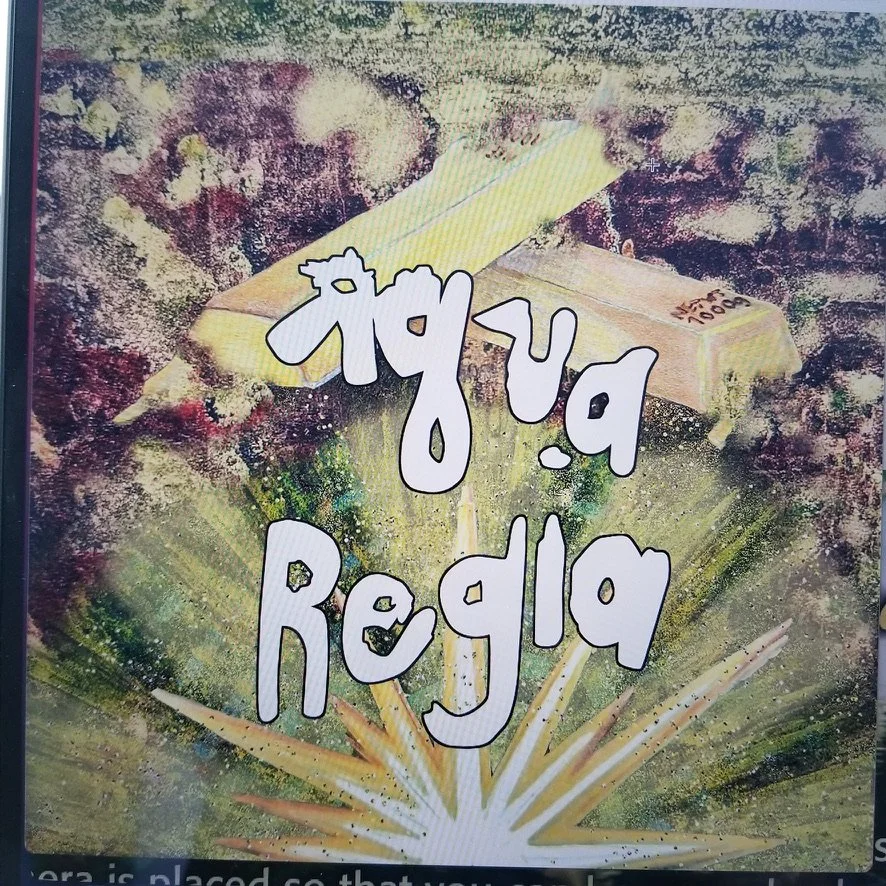
2021-03-24: Aqua Regia Song Cover
With Arjun being a scientist, I giggled to myself when I got the message from him about creating a new song cover called “Aqua Regia”. He sent me a link to learn more about this mixture and how it dissolves gold using nitric acid and hydrochloric acid. I actually became intrigued by the story of a man who in the 1940’s, dissolved the gold Noble Prizes of two winners in aqua regia to prevent the Nazis from taking them. Then after the war, he precipitated the gold out of the acid to their original. It was quite fascinating and I couldn’t wait to get started on this one.
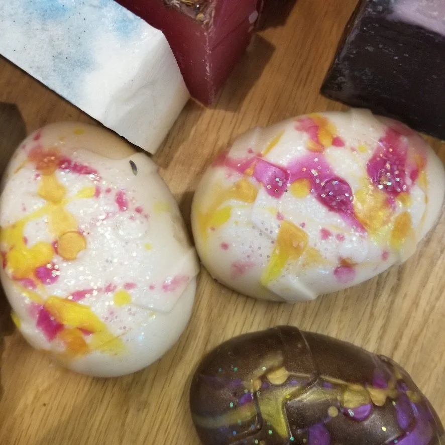
Arjun’s request was to have gold bars flaking off and merging into light. Tough request, but doable. It was around Easter time and I actually got inspired by these eggs at Whole Foods (pictured right) since they had gold flakes on the top.
I used black mixed media paper again, pastels, and watercolor for the background. Color pencils and sharpie for the gold bars and chalkboard marker for the white light.
I remember almost getting to a breaking point where I wasn’t sure if I was going to be able to finish. You’ll see in the progress photos below, I originally designed the bottom portion with these white vertical lines. Not sure where it was coming from, but I couldn’t get myself to cover them up further with more layers including the bright light. Arjun is always a great facilitator to help me get through these sticking points and with a few suggestions, we made it happen and got their song cover.
Progress Photos


2021-01-31: Falcon Funk Song Cover
This instrumental track has an upbeat, jazzy feel to it. Arjun mentioned there were additional instruments like the trumpet in this one and when I hit play for the first time, it had me up and dancing in no time. I loved it. The only request from Arjun was a falcon on the front of the song cover.
I’ve learned with my art process that I prefer abstract concepts. Let’s throw some layers of paint onto a page, create details
around what morphed, and then write some words. Well when it comes to drawing pictures of real things such as animals or people, it’s not my comfort zone. But I learned from the first song cover that none of this was going to be in my comfort zone and I was going to have to step out of it.
I did apply water color though first down the center of the black mixed media painting. From there, I started to see the shape of the falcon’s head and wings then went to town with the rest. Apparently the falcon wanted to try and pick up a trumpet or be blown away by the trumpet (I’m not quite sure). It showed up on the bottom of the page, which I quite liked because that’s the instrument that really got me up and moving in the first place when listening.
Second track was done. That’s why I started to feel anxiety over what if Arjun asks me to do another one. Where will I get the inspiration to keep going with these. This was another bit of resistance I had in me. I always knew I could do one or two design pieces, but to consistently produce work. That was a different story. I knew I had to push through because Arjun was going to keep making music. This was certain because he loved to compose.
Progress Photos


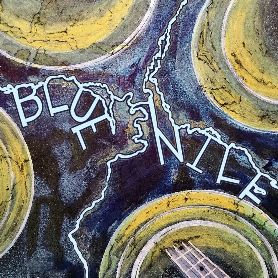
2021-01-24: Blue Nile Song Cover
When I found out I was recommended to help Arjun with his first song cover, my resistance immediately came to the surface. I had always been nervous about doing custom design products. This fear stemmed way back to when I was going the graphic design route in college and suddenly switched to nursing because I didn’t have the confidence in what I was doing to really pursue it.
I pushed this feeling down and surrendered. At this time in my life, I
had a deep knowing that everything was already created in the universe and we simply had to learn to be the channel for these works to come through. So I graciously accepted this new endeavor and went full force against this inner resistance.
There is a pool by my house and I would go there to watch the way the water rippled. I brought my new black mixed media paper and wanted to try the water color out on it. I had a feeling it wasn’t going to show very well, but thought with the addition of colored pencils, acrylic paint and whatever else I could find in my art supply drawers I would use.
The reason I like to start with watercolor is because it flows freely onto the page. This is my way of saying, “You start the artwork for me and I’ll keep following through with my intuitional guidance to take the next step.” From there I can see what’s starting to form on the page and begin adding more layers.
Arjun wanted a bass guitar in the photos so after creating the circles, I used a blade to apply a tearing effect where the guitar would come out from. Then I could see where the letters were going to stem off the river part to write “Blue Nile.”
If I wouldn’t have resisted my resistance, I wouldn’t have taken the opportunity to do this for Arjun. I think back to how important it is to face our fears and keep doing what we know in our hearts is what we’re meant to do.
Progress Photos


Phat N.
Interests: Science, Space, Design, Technology, Military

Phat N.
Interests: SCIENCE, SPACE, DESIGN, TECHNOLOGY, MILITARY
Blog Posts
2021-10-30: Never Give Up On Space Google Site Creation
Taking an idea and bringing it into form is not an easy task. Every step of the way needs to be thought through because you’re not simply reading from instructions to piece together your project. You’re actually conceptualizing your idea, architecting it, and then building it on your own.
Phat had an interest in watching instructional youtube videos and telling me all about how these youtubers were building rockets and parachutes and conducting various science experiments. All the avenues he was really interested in. I gently nudged him a few times to try out doing some of these projects on his own with one recommendation. I wanted him to use these videos as inspiration instead of simply copying them. Why? Because I knew it took a greater will power to develop something of his own. Not a new invention, but his own way of building something.
Phat tried out a parachute first and was pretty successful. We attached the parachute he made to a slimline aluminum bottle and got it up in the air a few times during our sessions to see if it would deploy. It did, but it needed to get to a higher elevation to really see if it worked. That would have to come at a later date.
Then Phat had an idea on how to build a rocket with some supplies he had in his house. I loved this idea of repurposing materials he already had so he didn’t have to purchase anything. The funny part was Phat didn’t tell me at first, but I knew he was working on something. I supported him with any kinds of questions he had, such as double checking math calculations for how to determine the diameter of a circle or mentioning how he had some dowels on one of the tables in his room and maybe it’d be a good support for a structure. Again I was thinking he was making a rocket, but wasn’t sure.

THE ROCKET
Two weeks later, Phat showed me the rocket and I was blown away. Not only by his ability to make it, but also by his creative skills to use the supplies he already had.

SPACE ARTWORK
Shortly after, this incredible artwork came through him.

ADDED COLOR
We brought this artwork into photoshop during our session and added a little color.
Next, I mentioned to Phat that I thought we needed to showcase his recent work on a free google site. He was excited and so was his family.
We took to designing this site over the next couple weeks, adding all his great content, and developing a parachute project for him and anybody else who was interested could work on together.
I was going to use Phat’s artwork above as the home page banner, but I was thinking how we still needed something original for the other section banners. Without mentioning this to him beforehand, Phat showed me this new set-up with his telescope. He put the telescope facing straight to the ground, placed a go pro to look through the eye piece, connected the go pro to our zoom session so I could see whatever was being shown through the telescope, and then Phat placed some pieces of colorful paper under the telescope. I was very curious to see what was going to happen. This is what came through on my end.


It was perfect. There were our header pictures and he didn’t even know we were needing them.
So Phat’s ideas all came to life in a very natural way.
Click the image below to be taken to the “Never Give Up On Space” google site.

Request Support
MY OFFERING